
JonesX Mission: SULTAN Graphing Activity
Welcome to the SULTAN graphing activity! As part of your JonesX mission, you’ve conducted a reaction time experiment. Now it’s time to graph your data using Scale, Units, Labeling, Titles, Accuracy, and Neatness. Use this activity to learn and review each principle.
1. Scale
For your notes (Scale):
- Choose a scale that includes all reaction times.
- Avoid crowding or stretching the data.
- Ensure the scale fits the graph space well.
Think about why choosing the right scale is important. How does it affect the readability of your data?
2. Units
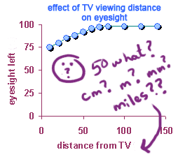
For your notes (Units):
- Include the correct units on both axes.
- Units ensure clarity in understanding the data.
- For time, use “seconds” (s) on the graph.
Consider which units you used in your experiment. Why is it important to label them correctly?
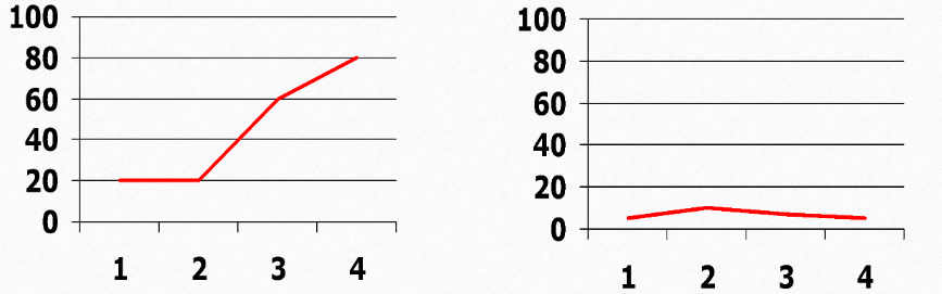
3. Labeling
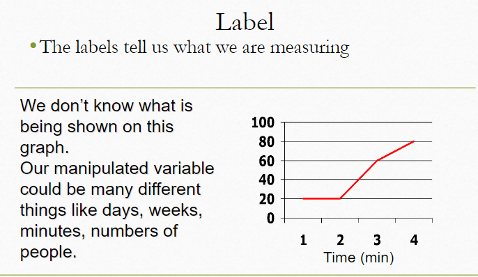
For your notes (Labeling):
- Label both axes clearly.
- X-axis: what was tested (e.g., stimuli type).
- Y-axis: what was measured (e.g., reaction time in seconds).
Think about why labeling is crucial. What would happen if your graph had no labels?
4. Titles
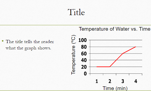
For your notes (Titles):
- Write a clear, informative title.
- The title should summarize the graph’s purpose.
- Example: “Reaction Time Comparison Under Different Conditions.”
Why is a title important for your graph? How does it help in understanding the data?
5. Accuracy
For your notes (Accuracy):
- Ensure all data points are plotted accurately.
- Double-check values and avoid errors.
- Accuracy reflects the real reaction times from your experiment.
Consider how accuracy impacts the usefulness of your graph. What are the effects of inaccuracies?
6. Neatness

For your notes (Neatness):
- Ensure your graph is clean and easy to read.
- Avoid clutter and overlapping elements.
- Make sure all elements are aligned and readable.
How does neatness affect the readability of your graph? What are the benefits of a well-organized graph?
7. Common Problems and How to Avoid Them
Common Problems:
- Cramped Scale: Ensure the scale is appropriate for the data range. Avoid having data points too close together.
- Line Graphs for Comparative Data: Use bar graphs for comparing distinct categories or groups. Use line graphs to show trends over time.
- Starting Line Graphs at Zero: Don’t always start at zero if it doesn’t accurately reflect the data’s range. Use a scale that fits the data properly.
- Mixing Up Axes: Ensure data is placed on the correct axis. The x-axis should represent categories or time, and the y-axis should show the measured values.
For your notes (Common Problems):
- Check your scale to avoid cramped data.
- Choose the correct type of graph based on your data.
- Decide whether to start your axis at zero based on your data range.
- Make sure data is on the correct axis for accurate representation.